the adaptive storefront: a new blueprint for ecommerce app design
the old model of ecommerce apps is a relic. winning brands are building adaptive storefronts that reconfigure themselves around each shopper in real time.

It’s no secret that app users convert at a rate two to three times higher than mobile web visitors. That stat isn’t new. What is new is the widening gap between brands coasting on a basic app and those fundamentally rethinking what a mobile shopping experience can be.
The old model treated an app as just another channel, a shrunken version of your desktop site. That thinking is a relic. With over 70% of global ecommerce traffic now flowing through mobile devices, the app is the primary touchpoint for your most valuable customers.
In 2026 and beyond, winning apps are not acting like static catalogs. They are becoming adaptive storefronts, dynamically reconfiguring themselves around the individual shopper in real time. This isn't science fiction. It's the new operational standard for high-growth ecommerce.
From Static Channel to Dynamic Environment
So what does an adaptive storefront actually look like in practice? It means moving beyond fixed templates and treating every single screen as an algorithmic surface. The home feed, category pages, product listings, and even search results are no longer one-size-fits-all. They become deeply personal experiences, shaped by user behavior.
Imagine a shopper opens your app. Instead of a generic hero banner, the app surfaces a curated collection based on a brand they viewed last week. Later, when they search for "running shoes," the product grid not only shows relevant items but also prioritizes the styles and colors that align with their past browsing history. The UI is a living system, not a rigid container.
This approach transforms the app from a simple sales tool into a personalized discovery engine. For brands, this isn't just about showing users more of what they've already bought. It's about using intelligent design and targeted ai automation to anticipate needs, reduce choice fatigue, and make the path to purchase feel effortless and uniquely theirs.

The Pillars of an Adaptive App Experience
Building an app that thinks and responds requires a strategy built on a few core pillars. You need true personalization, functional motion design, and a foundation of evidence-based usability. These elements must work in concert. Personalization without usability is chaos, and usability without personalization feels sterile and dated.
AI-Driven Personalization is Now Table Stakes
Hyper-personalization is the engine of the adaptive storefront. By 2026, this concept goes far beyond showing a carousel of "recently viewed" items. We're talking about apps that dynamically adapt their entire layout, content hierarchy, and promotional offers based on real-time behavioral signals, not just a user's stated preferences.
This is where the homepage stops being a collection of static banners and becomes a unique, algorithmically sorted feed for every single user. This means product listing pages might change their default sort order, or different promotional modules might appear for different user segments. It's a complex task, but it's what users, conditioned by platforms like TikTok and Instagram, now expect.
Micro-interactions as Functional Signals
For years, designers talked about micro-interactions as sources of “delight.” That’s not the point anymore. In an adaptive interface, motion and animation are critical for wayfinding and clarity. They are conversion levers, not just decoration.
When a product grid fluidly re-sorts itself based on a a new filter, a subtle animation shows the user what just happened and why. A tap on an "add to cart" button should trigger a brief visual confirmation, or even light haptic feedback, to confirm the action without ambiguity. These small moments reduce cognitive load and build shopper confidence, which correlates directly with higher checkout completion rates.
Product teams now prototype these dynamic transitions using tools like Figma. Its modern features let designers map out immersive interactions and test how they guide users through a fluid, personalized journey. It’s a core part of the design process for any serious mobile commerce project.
Build on a Foundation of Proven UX
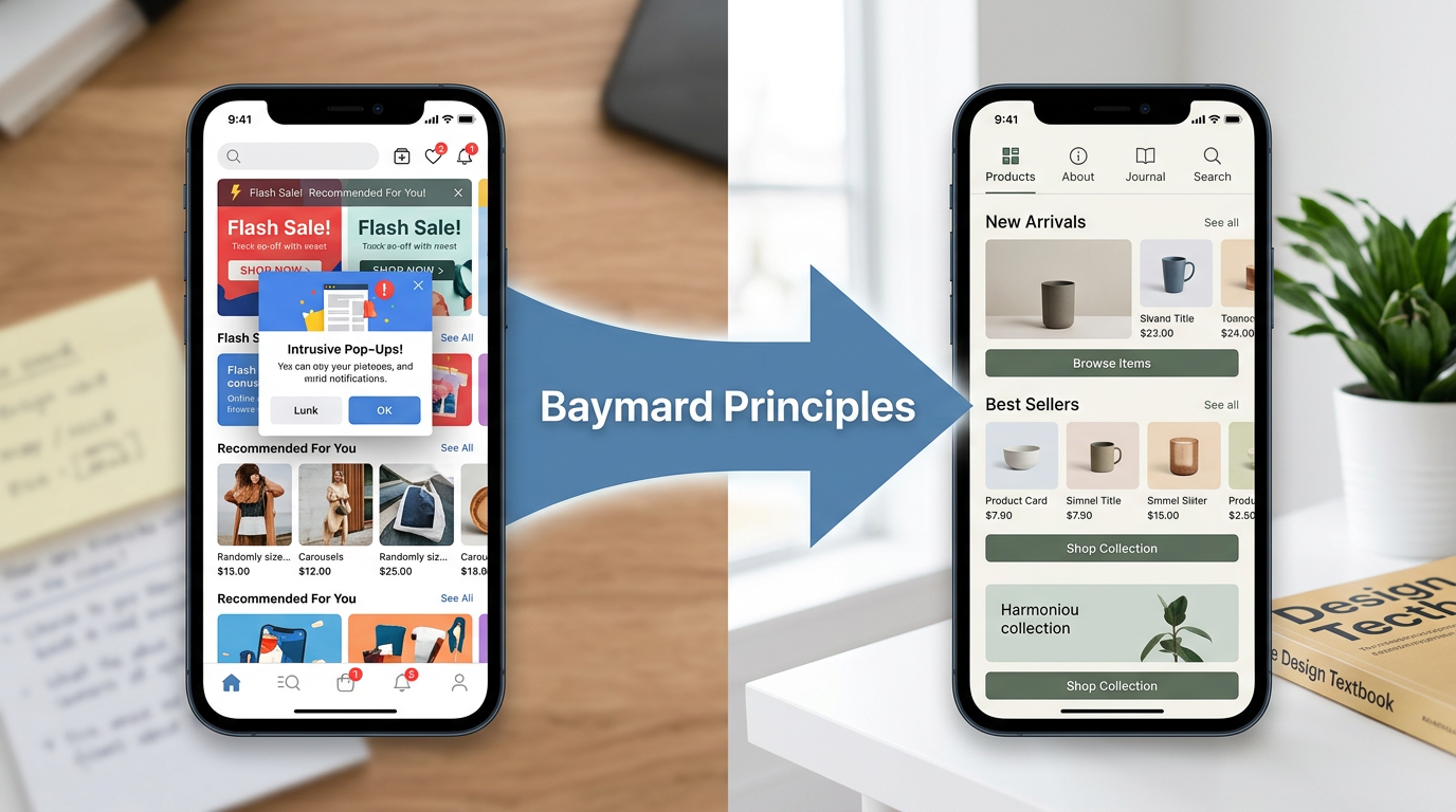
Endless personalization can quickly become overwhelming if it breaks fundamental usability patterns. This is where evidence-based research becomes non-negotiable. Throwing every product a user might like onto a single screen creates noise, not value. The art is in balancing algorithmic discovery with proven navigation principles.
The Baymard Institute, a leader in large-scale ecommerce usability research, provides an excellent playbook for this. Their work highlights recurring pitfalls and prescribes solutions that have been tested with thousands of real users. Following Baymard’s mobile ecommerce UX research helps ground your design in what actually works for shoppers.
This research identifies clear standards for high-performing ecommerce apps. Always expose a visible “Categories” or “Shop” entry point. Ensure all product shots support high-resolution pinch-to-zoom. Keep search, cart, and account functions in a persistent top or bottom navigation bar. These rules are the guardrails that make personalized experiences usable and effective.
Designing for Shorter Attention and Higher Intent
The mobile context is fundamentally different. Users are often distracted, on the go, and have far less patience than they do on a desktop. An adaptive app's primary job is to respect this reality by designing for short attention spans while capitalizing on moments of high purchase intent.
This means embracing low-cognitive-load design. Don't bombard the user with choices. Instead, use personalization to make smarter defaults. If a user always shops for a specific size, pre-select it on product pages. If they always use the same payment method, make it the one-tap option at checkout.
Every interaction should be purposeful. Notifications must be well-scoped and immediately valuable, not just generic blasts. The goal is to make the entire experience feel efficient and respectful of the user's time. This sustainable design approach combats app fatigue and is a powerful differentiator that builds long-term loyalty.
The Invisible Infrastructure: Seamless Checkout
Even the most brilliant discovery experience falls apart at a clunky login or payment screen. The final piece of the adaptive storefront is making authentication and checkout so seamless they become practically invisible. Friction at this stage is a notorious conversion killer, and it's where many apps fail.
Passwordless authentication is the new default. Forcing a user to remember a complex password is an unnecessary obstacle when Face ID and fingerprint sensors are built into every modern phone. This has become a baseline user expectation, not a premium feature for top-tier apps. Ignoring it signals that your app is behind the times.
When you tie biometric login directly to one-tap payment wallets like Apple Pay, Google Pay, or Shop Pay, you compress the entire login-and-checkout flow into seconds. This is one of the most reliable methods for lifting mobile conversion rates. It is a massive advantage that custom mobile apps have over the mobile web, turning the app into a secure and trusted purchasing tool.
Tools and Stacks for the Modern Ecommerce App
Building a truly adaptive app requires a modern toolchain for design, commerce, and analytics. The concept depends on the right technology to bring it to life, from the initial prototype to ongoing optimization and learning. The stack defines your capabilities.
A leading commerce backbone like Shopify provides an excellent reference. Its consumer-facing Shop app is a practical masterclass in current best practices. It showcases a personalized feed, unified order tracking, and the famously smooth Shop Pay checkout experience. It demonstrates what a commerce-first mobile architecture can achieve, even for brands on the platform.
On the analytics and optimization side, Google's Firebase platform is a common and powerful choice. It gives brands the tools to instrument detailed behavioral analytics, run sophisticated A/B tests on new features, and manage push messaging campaigns. This data is the lifeblood of any personalization engine, fueling the entire software development and iteration cycle by proving what actually moves the needle.
Your App Is Your Brand’s Future
The shift is clear. An ecommerce app is no longer an accessory to your website. It is the primary, most intimate, and highest-converting environment where you connect with your best customers. Treating it as anything less is leaving significant revenue and loyalty on the table.
Building an app that adapts to each user is a commitment to a new way of thinking about digital commerce. It demands a sophisticated blend of AI, user-centric design, and evidence-based standards. It’s hard work, but it’s the only way to win in the next era of mobile retail.
Ready to explore what an adaptive storefront could look like for your brand? The first step is a strategy conversation. You can request a quote to get started.